My Record Collection from A–Z
Alt-J
My record reviews aren’t off to the best start, as listening to these three Alt-J records leaves me a bit indifferent in a manner similar to Algiers.
Maybe it’s the lead singer’s voice, described in a pitchfork review: “The biggest offense one could take is the way Joe Newman sings through his nose, like a mean-spirited hobbit mocking the singing voice of another hobbit.” Ouch. Maybe it’s the eclecticism of the songs or that music nerd aesthetic that seems to hang over the band. Sometimes all of the layers come together in a captivating way but a lot of the time I’m just wondering if they’re doing one of those “let’s explore a century of musical styles” project. And what is it about English rock bands and English folk music? Can’t say that the genre appeals to my ears and I have to endure it so often—Cream, Led Zeppelin—who hasn’t indulged?
But they did win the Mercury Prize and were touted as the “next Radiohead”, so what do I know? Can’t imagine being compared to Radiohead isn’t just a way of foreshadowing disappointment. Here are the albums, in order from first to latest.
An Awesome Wave
For as lauded as it was, this record seems uneven to me. Maybe that’s a good thing? Seems like the hits are bigger even though the misses are bigger too? Breezeblocks is a cool track. Cool video too.
Whenever I hear Tessellate, it reminds me of the CBC radio show, “The Signal” with Laurie Brown, which is sadly no longer on the air. It’s a solid track.
Their performance at Glastonbury in 2013 was pretty strong. But it’s Glastonbury. Who doesn’t have Glastonbury on the bucket list?
https://www.youtube.com/watch?v=Ew01ZSQKRC0
But pulling from Wikipedia, reviews are much better: An Awesome Wave received generally positive reviews from music critics. At Metacritic, which assigns a normalised rating out of 100 to reviews from mainstream critics, the album received an average score of 71, based on 20 reviews, which indicates "generally favorable reviews".[7] Jenny Stevens of NME felt that "the charm of Alt-J's musical scatterbrain is that it works", describing the album as "on the surface... smart alt-pop" while noting that the band "have messed with the formula just enough to make this a brilliantly disquieting debut" and that "in refusing to submit to the rigours of a genre, they might just have made themselves masters of their own."[2] Andy Baber of musicOMH praised the band's ability to mix different musical styles and instruments on the album without coming off as forced or over-complicated.[15] Similarly, BBC Music's Jen Long wrote that An Awesome Wave "spans every workable idea, genre, and influence that can be crammed under the guitar music umbrella, yet it never feels disorientating" and called it an "entirely comprehendible and accessible collection of beautiful pop songs."[16]
Ruth Singleton of Drowned in Sound described An Awesome Wave as "a beautifully rounded, awesome debut album" and said that "whatever Alt-J were aiming for with their debut album, they have managed to prove their value as talented musicians, literary enthusiasts and imagery aficionados."[17] Joe Zadeh of Clash praised the band as "young, yet somehow void of naivety."[18] Jon O'Brien of AllMusic felt that the album was "occasionally guilty of pretentiousness", but that its "eclectic arrays of sound are woven together in a manner so effortlessly that the results never feel forced or contrived.”
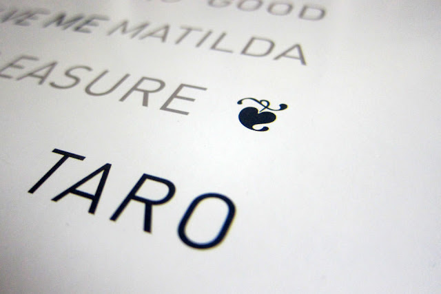
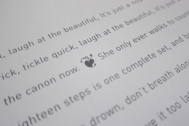
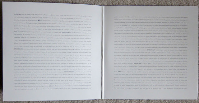
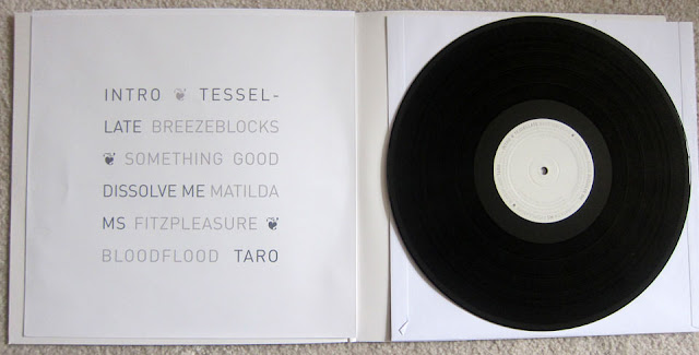
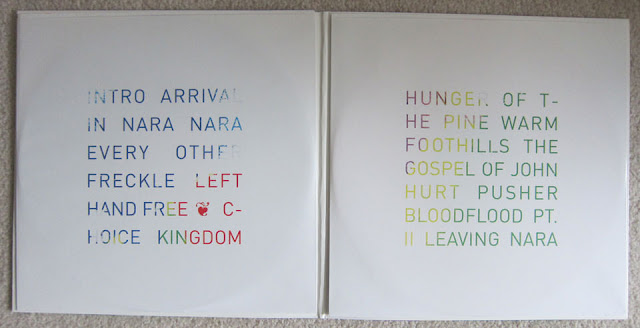
The album artwork is what appears to be a satellite image of a river delta with manipulated color to show effluence from one body of water into another. This image stretches around front and back. The gatefold conveys lyrics in two big squares with bold, all-caps text indicating the track name. A fleuron is oddly positioned between two sentences in the lyrics of the first song. The record sleeve lists the tracks in two variations of grey with more fleurons. The reverse has what appears to be a portrait of all the band members superimposed on each other? There doesn’t appear to be any other information about the recording or design anywhere in the packaging. This record also contains one of those curiosities of contemporary vinyl production. There is a full, printed sleeve included but the disc actually came in a heavyweight, plain paper sleeve. Gotta keep that printed sleeve pristine and avoid having that 180gram vinyl crack the seams.
This is Yours
Out of the three, this is the first record of theirs that I purchased and I think I still like it best. It doesn’t have the stand out tracks like Breezeblocks but I like the overall arc of the album. This is in contrast to the Pitchfork review which really hated it. “Alt-J's sophomore effort fails not because of hype or unfair standards but because it's dull and tuneless—a frustrating development for those who still believe in alt-rock as an incubator for unfashionable and undeniably great bands.” Ouch. Maybe it’s telling, too that the Wikipedia entry didn’t have any reviewer’s quotes? Compared to the other two albums?
The artwork for this album is somewhat generic as well. Really, the first album was pretty mundane as well (the cover art is basically a stock photo). The painting that serves as the cover is simply flipped for the back. The gatefold design is really similar to their first album. The fleuron reappears, this time positioned inexplicably between two track names. The sleeves repeat the track names in large sans serif, all caps type, containing what appears to be paint and texture reminiscent of the album cover. I couldn’t find any information about the cover art or designers listed anywhere in the packaging. But it seems very similar in design to the first album. The discs are colored vinyl and who doesn’t like colored vinyl?
Relaxer
I listen to the albums again while I work on these posts. So, I’ve gone through all three of these again, in a row. And because of my inability to summarize them, I listened to each of them more than once in MP3 and live versions. As much as I’ve tried, I’ve had the most trouble getting into this latest one. I think a lot of it has to do with what I consider to be the most annoying track on the album: their cover of House of the Rising Sun. It’s pedestrian and emotionless. As soon as it comes on, I just want to turn the album off, let alone sit through another five tracks. We’ll get back to this song (and my opinions) when we talk about the Animals.
Was Deadcrush the first single? It has a really creepy video. I’ve been meaning to ask Michelle what she thinks of the dancing.
https://www.youtube.com/watch?v=GOJUNJ1o394
I’ll paste in some of the comments about the record from Wikipedia: At Metacritic, which assigns a normalized rating out of 100 to reviews from mainstream publications, Relaxer received an average score of 65, based on 27 reviews.[32] In The Daily Telegraph, chief critic Neil McCormick found it "deeply gorgeous and utterly baffling", labelling it "internet era pop" with its "barrier-free absorption of so many different musical styles a product of the computer recording technology it is created with."[1] Lisa Wright of DIY praised the album, stating alt-J have "crafted possibly the most strangely original niche in modern music."[40] Kyle Mullin of Under the Radar praised the album's diversity: "This all-over-the-map approach makes Relaxer a bit dizzying and tough to digest at first, and yet you'll be immediately captivated and intrigued by its distinctive mix. And once you give it a few more listens, many of its varied songs will worm their way into your ears as some of this summer's best indie rock offerings."
All things being said, they had a nice tiny desk concert in support of this record. The strings and forced low-key approach improve the record a lot.
https://www.youtube.com/watch?v=8zHdLF3-coA
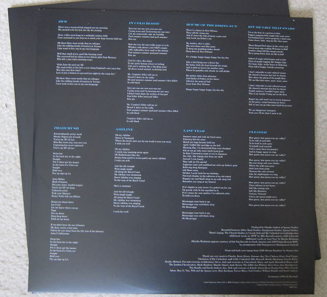
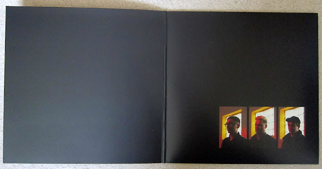
I think what bugs me the most about this record is the design. It’s really ugly. Black with white borders around the artwork and modern typeface in all caps and italicized and terrible letterspacing. Song titles in the same typeface in blue on black. The lyrics are at least set in the roman weight and are surprisingly legible for their point size and style. The graphics look like they were clipped from an old video game and the sleeve has a pattern on it that looks like one of those “seeing eye” pictures. I actually stared at it for a while to see if there was an image hidden in there but I didn’t see anything. One more disappointment from this album…This pattern is repeated on the inside of the pocket that holds the disc. An interesting detail, too bad the image is annoying. The liner notes are on the reverse of the sleeve, along with the lyrics and list the front and back cover image as “from ‘LSD Dream Emulator’ by Osamu Sato. http://www.osamusato.net/ Click on the link for a lot more of the same thing. No designer is listed. Reminds me of an article I read recently about the Taylor Swift record and the “anti-design” movement that seems to be affecting album design lately.
http://designtaxi.com/news/395284/Designer-Unpacks-Taylor-Swift-s-Album-Art-And-The-Brutal-Anti-Design-Trend/
Here are all of the pitchfork reviews. They’re not fans:
https://pitchfork.com/reviews/albums/17233-an-awesome-wave/
https://pitchfork.com/reviews/albums/19843-alt-j-this-is-all-yours/
https://pitchfork.com/reviews/albums/23315-relaxer/
Ultimately, every time I listen to them I have their tunes stuck in my head for awhile. Pretty catchy. They must be doing something right. But you should make up your own mind:
http://www.altjband.com/#
https://en.wikipedia.org/wiki/Alt-J








Comments
Post a Comment